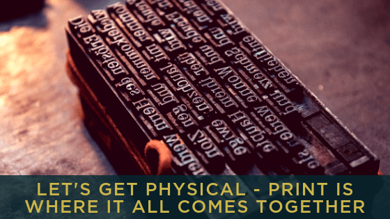
Let’s get Physical!
Print is where it all comes together
Words are the remit of the copywriter and they will show up on the web and in social media and PR and in print, packaging and display. Visuals are the remit of the graphic designer, and the first piece of work will be your brand and the shortcut to your brand, is your logo.
In print these two elements come together with format and material to create the presence of your brand in any physical location.
Print invokes trust, it creates a lasting impression, so it is crucial that the format and material that you use are carefully chosen.
People touch and hold print, so the material that you choose is significant, should it be bright and shiny or soft and subtle; your choice will be dependent on the brand values that you have determined.
Match your printed matter to your business
If you are selling a service that needs to be perceived as very good value, expensive finishing touches like gold foil are not necessary. However, if you are operating in a luxury market, using those finishes is totally appropriate.
If your business is very formal you may need letterheads for agreements and proposals, if more casual then postcards and labels may serve you better.
Be consistent
Everything that you do to market your business should be consistent with your offering, otherwise your customers get confused.
That is never more true when you are looking at printed marketing materials for your business.
Once you have looked hard at your new business and really determined what it stands for, that needs to be articulated visually and in words.
- what values you bring to the market,
- who are your ideal clients, where are they
- why they will want to buy from you
Practically speaking….
Your brand guidelines should always include the colours that represent your brand and the order in which they should be used. Likewise with typefaces – ideally no more than two. Photographic style is also very important, a funeral director will have a very different style to a preschool.
By the way, image quality is different for print than it is for digital. Print demands higher resolution images and graphics that are not created from pixels.
Shapes and sizes of print are limitless but there are some conventions that need to be followed.
- Those square and mini business cards that online print sellers promote as different, are not kept by the people that you meet – they do not meet the conventions that we have for storing business cards, so they become an irritant, which is not the best reason for being remembered.
- If your book needs to sit on a book shelf, wire binding is not right for it. The spine needs to be visible for it to be chosen.
- If your labels need to work outside, don’t print them on paper and make sure that the adhesive is permanent.
Think strategically
When it comes to print, first think brand, then think about the message and the task that this piece needs to do for you. Is it to sell, is it to inform, is it to get people to show up.
Then, think about where it is going, how is it being distributed – are there any conventions or restrictions that will determine the shape and the weight of the material that you use.
Think strategy first, and you will spend your money, however much you have, more effectively.
 Many thanks to Gill Robinson for this guest blog. If you want to find out more about Gill and Nexus Creative Print Production or get in touch with her, go to nexuscpp.co.uk for more information.


Leave a Reply
Want to join the discussion?Feel free to contribute!